Edisto Blackwater Boogie: Website Design, Development, & Hosting, Logo Design & Branding

What We Did For Them: Website Design, Website Development, Website Hosting, Logo Design & Branding, Print & Digital Graphic Design, Content Writing, Social Media Management 

Industry: Nonprofit

The Edisto Blackwater Boogie was a unique project and involved the efforts of several different members of the community. We got involved when one of our current clients asked if we could help with designing and creating a website. Ultimately, we ended up as a part of the festival committee and offered to help sponsor the event by donating all marketing services.

The Logo

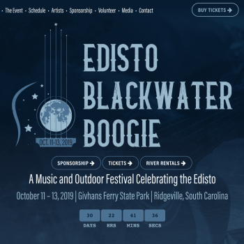
When creating the logo for the Edisto Blackwater Boogie, our graphic designer concentrated on portraying what the festival is about. The Edisto Blackwater Boogie is a music and outdoor festival, so it was important to create something appealing to the types of people who are interested in similar festivals, without alienating people who may not typically attend such festivals. 

We wanted the logo to be aesthetically pleasing while tying together the different elements of music and the great outdoors. At the same time, we had to make sure the logo we designed would translate well across several different mediums, including screen printing. 

Above all, we wanted to make a unique logo that would look great on merchandise like T-shirts, a logo people would be excited about and would be happy to wear. 

Consequently, our graphic designer chose specifically two colors which looked good on both dark and light backgrounds, specifically keeping budget for screen printing in mind. She also focused on elements of the festival itself; there’s a moon because the Edisto Blackwater Boogie takes place over a full moon weekend. There’s a guitar shape because there will be live musical performances. There’s a sprinkling of stars to represent the night sky. The curve of the body of the guitar in the logo is a subtle reference to the Edisto River itself. She also chose a font suited to a folk/bluesy tone. 

The Website

The festival planning committee was comprised of people with very different backgrounds and specialties, so we were the group with the most experience with web design and development. 

We took note of what features everyone on the committee wanted to be included on the website and designed it to meet all of the diverse needs. 

The main purpose of the website for the Edisto Blackwater Boogie was ticket sales, so we made sure to make the option to purchase tickets as visible and easy as possible.  

Beyond ticket sales, there were several different aspects festival committee members wanted to focus on. Consequently, we needed to figure out a way to organize an overwhelming amount of information in an approachable way. 

The schedule of events, artist/band lineup, different activities available at the festival, volunteer information and sign up, and sponsorship information (both opportunities and current sponsors) were all other important highlights. We designed a finished product capable of showcasing a wide breadth of information in an interesting way without distracting from the overarching goal of ticket sales. 

One of the ways we were able to display a large amount of information without making the user experience confusing was by having a clear, concise navigation menu. The homepage has a balance between the large display of the logo as well as relevant event info, including a countdown, the date, time, location, as well as buttons promoting sponsorship, ticket sales, and event activities—and it’s all right there when you first load the page.   

In addition to making sure the website worked well and made sense, we designed the website to be appealing and visually striking. Since the Edisto Blackwater Boogie is a celebration, we wanted their website to be very trendy and fun. 

Each page has sliding background images featuring images of the Edisto, of the campgrounds at Givhans Ferry State Park, of musicians—each image represents the experience someone can expect to have during the festival. We made sure the picture transitions were slow enough to make the background very subtle yet still engaging without being distracting. 

The website for the Edisto Blackwater Boogie leaned heavily on advanced CSS, which enabled features like the sliding background images, the color overlays, and the style of the footer with its outline of the trees (which reflect the actual treeline of the state park). Nothing about the website is generic—every detail reflects an aspect of the event.

Social Media Management and Content Writing

The Edisto Blackwater Boogie required a broad range of content for their marketing leading up to the event. Services we provided ranged from creating and managing pages on social media to writing content for their website, handouts, and magazine editorials. We also designed any handouts and posters they needed — basically, we provided them with all the same features as a full-service marketing agency.  

We also managed Facebook Ad and Google Ad campaigns based on a predetermined budget. Since the funds were from a nonprofit, we had more restrictions on how we could use them. We decided how to best allocate funds by analyzing data from initial campaigns and constantly evaluating our approach.   

The Edisto Blackwater Boogie was a large project with many moving parts, but in the end, we successfully coordinated with several other organizations to manage the marketing efforts for a very exciting event! We plan to be a large part of the Edisto Blackwater Boogie in the years to come. 

View the Website

Dorchester Children’s Advocacy Center: Website Design, Website Development, Website Hosting

What we did for them: Website Design & Development, Website Hosting, Ongoing Website Maintenance

Industry: Nonprofit

Dorchester Children’s Advocacy Center is a 501c3 non-profit organization serving abused and neglected children and their families from Dorchester County and parts of Berkeley and Charleston Counties. Dorchester Children’s Advocacy Center works in collaboration with law enforcement, DSS, Guardian Ad Litems, Mental Health and other agencies involved in caring for abused and neglected children in our community. 

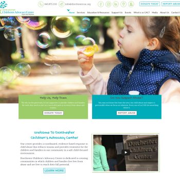
While designing the website, we focused on bringing a friendly, playful element without detracting from the serious nature of what Dorchester Children’s Advocacy Center is dedicated to. We accomplished a balance by creating hand-drawn elements, like icons and titles, while maintaining a clean and professional aesthetic.

Dorchester Children’s Advocacy Center’s main two focuses for the website were reporting abuse and donating. Consequently, we made sure there was a call-to-action (CTA) for both options in the header of the site, so no matter what page a visitor is on, they will always be able to see the option to donate or report abuse. 

Ease of use and a clean, clear design are always one of the primary focuses when we design websites for our clients. We designed their new website to be user-friendly from both the front end (for website visitors) and the back end (for when staff at Dorchester Children’s Advocacy Center needs to make a quick edit).   

Every single page received individual attention because each page has unique content. Dorchester Children’s Advocacy Center is a large organization and they provide several different services to the community. They have over 40 pages—they have a lot of services, offer all kinds of education & training, and there are a lot of different sections to highlight for donations and support. They organize many events. They have a lot of information about who they are and what they do. 

Their website was huge and we made it very easy for people to find what they were looking for. So, we condensed the top-level navigation and made each parent page which features a nice preview of all the sections under the page. Every page was addressed individually and designed based on what the page needed. 

A great example is the contact form. With their contact form, we made sure to consider what features would be easiest for both the user and the client. DCAC has 10 different departments information from a contact form would go to. We set up conditional logic which ensures forms will go straight to the person in the relevant department, making it a simpler experience for everyone involved.  

A more user-centric feature of the site is the section on the home page directed towards “Caregivers,” “Professionals,” or “Supporters.” It’s a different way to find a page you may need. So specifically, the Caregivers section goes to the therapy page, the Professionals section directs to educational resources, and the Supporters section routes to the donate option. Designing it this way is more engaging and considers the user’s perspective.   

It was interesting and fun to work on building out so many different pages with different content in a way unique to every page but still cohesive and consistent with the website as a whole. 

The Dorchester Children’s Advocacy Center is a very large organization with many decision-makers. Our graphic designer, Sarah, worked directly with 2 staff members, Faith and Melissa, to make sure all information and ideas were passed on properly and applied correctly on the website. We were ultimately able to present it to the board and had complete approval upon the first review. 

Visit the Website

Dorchester Habitat for Humanity: Website Design, Website Development, Website Hosting

What we did for them: Website Design & Development, Website Hosting, Ongoing Website Maintenance

Industry: Nonprofit

Habitat for Humanity works to provide people with decent, affordable housing. The nonprofit is also dedicated to building strength, stability, and self-reliance in the community. We had been providing IT services with the Dorchester branch of Habitat for Humanity for a while, and when they found they were in need of marketing help, we stepped forward to help them with a website. 

Their current website is a redesign of a website we made for them a few years ago. The original website we developed was still strong and functional, but every few years is a good guideline for getting a new website even if your current site is fine. A lot changes in three years—code programming changes, new plugins and extensions are available to be added, and it’s also a good time to sit down and revisit your business brand itself and think about how you want to present it. 

Additionally, at the time of our redesign, Habitat for Humanity corporate had new brand standards we needed to incorporate in updates on the website. The new brand standards included new logo and brand colors, typefaces, and other design guidelines we had to follow. 

Other than updating to reflect the brand, we wanted to make their website easier to use. Our goal was to make it so visitors coming to the website were easily able to find what they were looking for, whether it’s the Restore, how to donate, scheduling donation pickups, how to volunteer, or how the housing program works. We made it as easy as possible for people to help Habitat for Humanity. 

To achieve the goal of making the website as user-friendly as possible, we included a few new features. 

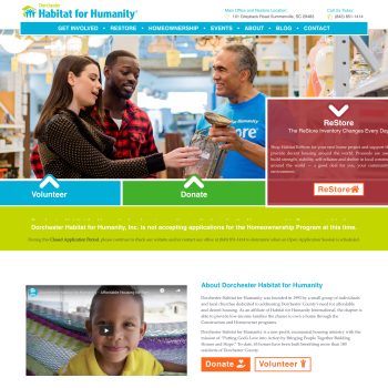
We wanted a specific ‘call to action’ (CTA) for how people can get involved, and we wanted to have a unique way to display this information rather than just a standard image slider. So, we designed a way to show a lengthy description with a call to action button to learn more about one of the three main ways they could help. The CTA feature is animated to automatically scroll and expose new sections so it’s not too much text all at once, and you can click on each tab individually.

We took great care to make sure each page is very clear while still being engaging. The content answers “what is this page and what should I be doing” while visuals and text are appealing and fit brand standards. The information on the site is arranged in a way that is easily readable and navigable but isn’t just placed in standard, boring, block ways. 

So, for example, you’ll find elements breaking out of their grids and boundaries to catch your eye, but the design remains balanced, structured, and flowing. We designed the website to be bright, friendly, and exciting. The layout is modern but clean, fun, and fresh. It’s intended to get people involved and excited about getting involved. 

One of ADVYON’s goals is to give back a portion of our time and financial rewards to local businesses who do great things in our community. We do a lot of work with nonprofits, and we put a good deal of effort into making it as easy as possible for people to help them. 

Visit the Website

James Island Youth Soccer Club

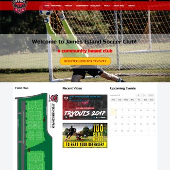
James Island Youth Soccer Club’s goal is to provide the best opportunity for children of all ages to develop and enhance their soccer abilities, technically and tactically, while maintaining a level of enjoyment and love for the game of soccer.  Visit The Website

Dorchester Habitat

Habitat for Humanity (HFH) is a nonprofit, ecumenical housing ministry founded in 1976 by Linda and Millard Fuller to show the love of Christ in action by eliminating substandard housing and homelessness from the face of the earth. Believing that “everyone who gets sleepy at night deserves a simple, decent place to lay their head” has led HFH to build 400,000 homes around the world, providing decent shelter for more than 2,000,000 people. Visit The Website

Katie’s Krops

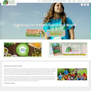
The mission of Katie’s Krops is to start and maintain vegetable gardens of all sizes and donate the harvest to help feed people in need, as well as to assist and inspire others to do the same. The problem of hunger is real, Katie’s Krops mission is simple, we all can help because… It only takes a seedling!

View The Website