Why is a website important for your business?

We’re excited to introduce ADVYON’s creative team.

A full-service marketing and creative agency that specializes in helping businesses like yours stand out online.

If you’re looking to create a strong online presence for your business, a well-designed website is an essential tool. However, designing a website that is visually appealing, easy to use, and optimized for search engines is no small feat. That’s where ADVYON’s Marketing Agency comes in.

A website is a crucial aspect of your business in today’s digital age. Having a professional, functional, and well-designed website can help you reach a wider audience, establish credibility, and increase your online visibility. Here are some of the reasons why a website is essential for your business.

Reach a wider audience: With a website, you can reach potential customers from all over. It allows you to target a larger audience beyond your geographical location and open up new markets for your business.

Establish credibility: A well-designed website helps to establish your brand and gives a professional impression to your potential customers. It demonstrates that you are a legitimate and credible business, which can help increase customer trust and confidence in your brand.

Increased online visibility: A website is one of the best ways to improve your online visibility and be found by potential customers searching for products or services like yours. By having a website, you can increase your chances of appearing in search engine results and being found by your target audience.

User-Friendly Interface: We design websites that are easy to use and navigate, ensuring that your customers have a positive experience when visiting your site. Our team will focus on creating a user-friendly interface that is intuitive and makes it easy for your customers to find the information they need.

Mobile Responsive: With the rise of mobile devices, it’s essential that your website is optimized for mobile use. ADVYON’s website design packages include mobile responsiveness, ensuring that your site looks great and functions well on any device.

24/7 accessibility: With a website, your customers can access information about your business and products or services at any time, day or night. This means that they can find the information they need when they need it, without having to wait for business hours.

SEO Optimization: ADVYON’s website design packages include search engine optimization (SEO) services, which will help your website rank higher on search engine results pages. This will increase your visibility and attract more potential customers to your site.

Increased Credibility: A professionally designed website will make your business look more credible and trustworthy to potential customers. It can help you stand out from competitors and establish a strong online presence.

Cost-effective marketing: A website is a cost-effective way to market your business and reach a larger audience. It provides an opportunity to showcase your products or services, communicate your brand message and reach potential customers without the need for a physical location or high advertising costs.

Better Return on Investment: While investing in a professional website design may seem like a significant expense, it’s important to consider the long-term benefits. A well-designed website can pay off in the form of increased traffic, higher conversion rates, and more sales, making it a smart investment for your business.

A website is a pivotal investment for any company trying to expand its market, build a reputation, improve its online presence, and provide customers access to it around the clock. So, if you haven’t already, it’s time to start thinking about building a custom-designed website!

ADVYON’s Marketing & Creative services offer a range of benefits, from increased credibility and improved user experience to higher conversion rates and better return on investment. By investing in a professional website design, you can establish a strong online presence for your business and attract more customers to your site.

Contact us today to learn more about our website design packages and how they can benefit your business.

Animal Medical West: Website Design and Content Writing

Website Design and Content Writing

What We Did For Them:  Website Design, Content Writing

Industry: Veterinary Clinic

The Website: 

When creating the new website for Animal Medical West, we prioritized making the website look friendly. We put a lot of thought into the aesthetics of the website because we wanted people to feel safe with the caring staff of AMW just by looking at their website. It can be hard for people to trust someone to care for their pets, so every design choice was made to create that feeling of trust for new customers.

The first design choice we made was the overall color scheme for the site. The main colors for the site include turquoise, orange, yellow, and red. These colors are designed to be vibrant, but not overwhelming, and are complementary to each other. Once we had the colors selected, we used them to create geometric shapes throughout the website. For any shape, we made sure that there were no harsh edges to ensure that the design was still welcoming, inviting, and friendly. We used a rounded angled border for the featured image in the header of each page, and rounded elements throughout the design. This was a subtle design choice that contributes to the friendly feeling of the site.

At the top of the page, we highlighted the most important information for pet owners. We included the phone number to allow clients to quickly have their questions answered. We also included directions to get to the office easily. Finding a veterinarian close to home is a priority for pet owners, so we were sure to give maps and directions high visibility throughout the site. We also included a “schedule an appointment” button in several different locations on the website, including the header, page load area, and middle. We made booking an appointment easy because it is the most common action customers want to complete on this site.

For our contact information, reviews, directions, and scheduling appointment buttons, we used yellow icons to create a unified appearance. We also created a unique paw print effect for the menu. When you hover over each page of the website, a different pet’s paw print appears. We also created a sticky menu with more information. This menu sticks to the top of the window while the user scrolls down the page. It showcases a small logo as well as the pages for each specific service. The sticky menu is colorful against a white background to match the rest of the site. We also included a “schedule an appointment” button in the sticky menu so that the customer can complete this action no matter where they are on the site.

After the initial page load, the next section we designed were the icons for each of the main service pages. We made this section large, graphic, and eye-catching because we wanted it to be easy for pet owners to find the main services offered by the veterinary clinic, including medical, boarding, grooming, and emergency services. Under the icons, we recapped the major services again for search engine optimization purposes, but made sure that this area still contributed to the overall design by utilizing colorful text and a yellow box.

We also created an overview of the company. This “keep your pet happy and healthy” section gives more details about the character of the company to create further trust. Under this information, we included the map so that pet owners in the area can easily find the office. We originally put the map toward the bottom of the page, but we decided to move it higher because location is one of the most important factors when choosing a veterinarian.

The next section is the testimonials section. This section showcases reviews from current clients, including pictures of their pets. This personalized touch creates trust in the staff and showing real pets adds an extra layer of social proof for new customers.

In the footer, we created an image slider with more pictures of animals and staff. This works as a reminder of the friendly, inviting aspects of the veterinarian’s office. The footer also includes important links, including the patient portal. These links will take the client to forms, special deals, and additional links. People are able to easily find the section of the website that they’re looking for. We put special thought into breaking up the footer so that it would look unique compared to other veterinary websites.

For the rest of our service pages, we chose to design a top-level navigation menu. Many websites choose to do a dropdown menu to save space, but creating a top level navigation menu that shows all of the services is better for search engine optimization and for users. It is easier to find out what services are provided by the vet and to easily learn about the practice without having to search for the right page. Each of our main service pages uses more images of the staff to show that they are friendly and dependable. Each service page also has a sidebar with links to other services to encourage continued clicking. Users don’t have to think about where they will go next, they can continue seamlessly learning about Animal Medical West by following links on any of the pages.

Our “patient portal” page holds most of the important information for clients. It houses forms including the schedule appointment form, online form for new clients, and drop-off and boarding forms. Each form can be filled out online or downloaded as a PDF to print and fill out later. The “current specials” page will be used for future growth as the vet offers more seasonal deals. Consistently updating this page will bring search engine optimization benefits for the company as they continue to grow.

We also modified the previous website’s “about us” page. This page now tells the story of AMW and includes biographies and photos of each of the staff members. Having a photo and fun facts about the people who work at Animal Medical West shows them to be approachable and competent. This creates further trust for pet owners who are able to see the people taking care of their beloved animals.

We also created sections to highlight AMW’s app. This unique app allows clients to look at their pet’s records, send messages to their vet, schedule an appointment, and get refills on medications. The app had never been highlighted on the company’s previous site, so we created a section on the patient portal page with information about the app and a pop-up on the homepage to drive more people to download the app. The pop-up was designed so that if someone clicks on one of the download options or on the exit arrow, the popup will not reappear for a week. This makes the pop-up informative without interrupting the user’s experience.

Content:

While Animal Medical West had a previous website that was well-written, we wanted to increase the search engine optimization value for the content. We thoroughly proof-read the entire site and added more detailed information about the services provided at AMW. We made sure that it was clear to customers and to search engines what services are provided by the vet and where they are located. These details will make it easier for local pet owners to find the Animal Medical West website at the top of their Google search results and quickly get the information they need.

Final Thoughts:

Creating this fun, friendly website was an enjoyable project for our team. We enjoyed creating the unique color scheme, geometric design elements, and showcasing many pictures of the staff and the adorable pets they treat. We were able to take the existing work of the AMW team and bring attention to their amazing team and the excellent veterinary services they provide. From the moment pet owners click on the site, we believe that they will feel certain they have found the perfect kind, thoughtful, and qualified veterinarians to care for their furry friends.

View the Website

US Water Recovery: Website Design and Content Writing

Website Design, Content Writing, and Search Engine Optimization

What We Did For Them: Website Design, Content Writing 

Industry: Wastewater Treatment

The Website: 

The main goal of the US Water Recovery (USWR) website was to highlight the water recovery facilities and to make the information on the site more visually appealing. Since USWR focuses on restoring nature by removing oil and other impurities from water, we began our design by choosing colors from nature for the site. USWR used blue in  their logo, so we added green and yellow (both abundant in nature) to accent the blue.

In laying out the website, we wanted to bring attention to two items: the location of the treatment plant and the 24-hour emergency services offered by US Water Recovery. We highlighted both of these items in the header at the top of the page. We also made sure that the contact information was readily available. This will help new customers looking for wastewater treatment to get in touch with USWR easily. We used yellow icons to bring attention to the contact information.

Throughout the rest of the home page, we wanted to ensure that the content had a good flow and was easy to read. At the top of the site, we highlighted the main services offered by US Water Recovery, including wastewater treatment, water and oil recycling, and transport services for industrial and marine organizations. Underneath, we created tabs to take the user to specific pages for each of these services so customers can quickly find the service they are looking for. 

We created several different icons to make navigating the website easier. This process began by finding the perfect set of contact information icons illustrating where best to get the email address, phone number, and address for the company. On the tabs for our service specific pages, we designed icons to match those used for the contact information and added a water droplet to each of these icons. The USWR logo already used a water droplet, so incorporating that droplet effect into the other icons helped create a unified look. 

The rest of the home page was designed to show pictures of the facility with straightforward information. The “Our Process” and “Our Facility” sections explain the process for treatment and how the facility is laid out. The page ends by showcasing the partners US Water Recovery works with. This allows new users to build trust with the company by seeing that organizations like the US Coast Guard and DHEC have worked with USWR before.

One of the main features of the website was our unique animation of flowing water at the top and bottom of the page. This effect was created with a unique code to give a wow factor to the website that would not take away from the important information on the site. The header at the top of every page also showcases a picture that fades to white while the user scrolls down the page. This clean fade effect reminds the user about the important work US Water Recovery does in cleaning impurities from natural water. 

Content:

Writing for this site required explaining many complicated procedures. USWR handles many treatment processes, including water treatment for the US Navy and Coastguard, DHEC, shipyards, and industrial machinery as well as emergency response to oil spills. We wanted to be sure that customers who were not familiar with the wastewater treatment process were able to understand what USWR can do, but we also wanted to make sure that experienced customers knew that USWR are experts in the field. Our content writer worked closely with the owner of US Water Recovery to ensure that everything was explained in a way that would make sense for every customer from casual viewer to wastewater expert.

Final Thoughts:

The US Water Recovery website was an engaging challenge for our team. It took careful consideration to share information from an industry that we had not worked with before. We feel that the animation, natural hues, understandable layout, and photos of the facility were able to capture the beauty that USWR contributes to the world by cleaning our water. The copy explains the process well for newcomers like us while still capturing all of the important technical FAQs for other wastewater treatment experts. With this clean new website, US Water Recovery is able to easily showcase their facilities and to explain their important work.

View the Website

Blue Waters Residential and Commercial Pool Maintenance

Website Design, Content Writing, and Search Engine Optimization

What We Did For Them: Website Design, Content Writing, Search Engine Optimization

Industry: Pool Maintenance Services

The Website: 

Overall Design: When creating the Blue Waters website, we wanted to capture the essence of what pools are all about: having fun. Pat Provost, the late founder of Blue Waters often said, “Nobody goes to the pool to have a bad time.” The goal of Blue Waters is to remove all the stress of keeping up with a pool so that home and business owners can focus on creating a good time for everyone who visits their pools.

Blue Waters wanted to appeal to hardworking homeowners in their design, specifically women who are home caretakers. We were inspired by the 1940’s and 1950’s pinup style images of hardworking housewives. This style is beloved by many of the women who use Blue Waters to maintain their pools and it uses the fun, vibrant colors that we wanted to incorporate into the design. From the images to the font and the colors used on the pages, we made sure that every element of the site had the feeling of a vacation in the 40’s-50’s.

At the top of the home page, we displayed rotating images showing every member of the family enjoying time at the pool. We included teenagers, young children, whole families, and of course, mom enjoying time alone relaxing in her pool. We curated these images to allow customers to see themselves represented in the site, no matter what stage of life.

The main color of the website is blue because it reminds the user of the company’s name– Blue Waters– and reminds them of how inviting a clean, cool, beautiful pool can be. We used both light and dark blues from the company’s logo and used orange to draw the eye to important buttons. Orange is a common color in many of the vintage images we used, is complementary to blue, and is a fun color that reminds the user of a day in the summer sun.

Functional Layout: In addition to making the home page beautiful, we wanted to make it easy to navigate. We believe that a website should be both beautiful and functional, so we were sure to create an understandable overall layout of the website and flow of the home page. The first thing the user sees are the most important actions (leave a review, get a quote), then before and after photos, reviews from other customers, history of the company, a breakdown of residential and commercial pool services offered by the company, job openings, and brands and associations.

The most important things customers typically do on the Blue Waters website are leave a review or look for reviews about the company to read and request a quote, both of which they can easily do by clicking buttons at the top of the page. 

Leaving a review will help Blue Waters grow their reputation for excellent service. Client reviews create social proof. Social proof is created when a new user who doesn’t know about the company gains a level of trust by seeing the successful results the company has provided to others. Reviews are the most reliable way to create social proof, so it was important to feature reviews in several locations on the Blue Waters website. 

Requesting a quote for service is the most common action Blue Waters customers want to complete on the site. We made the process extremely simple to allow customers to quickly get an estimate for their specific project. First, the customer clicks the “request a quote” button at the top, middle, or bottom of the home page. Then, the customer simply takes a picture of their pool and sends it via text or email. Finally, a representative from Blue Waters calls them back to discuss the details of the project and provide an estimate. The entire process can also be completed over the phone. The quote process is designed to adapt to the way of contact that is most comfortable for the customer.

We were able to show potential customers what a difference maintenance from Blue Waters can make by including a before and after slider on the home page. When a user drags the arrow over the image to the left, they can watch the pool transform from full of leaves to clear, clean, and inviting. This image makes it obvious what Blue Waters pool can do for their customers and it is situated right above the featured reviews from previous clients. The combination of the image and reviews creates a strong case for choosing Blue Waters.

Following the image slider, we wanted to create a section describing the history of the Blue Waters company. We included the company’s history as a trusted pool repair and maintenance company in Charleston, South Carolina since 1991 and described some of the major services offered by the company, including pool filters, heaters, pumps, repairs, and remodeling. We ended this section with a “contact us”‘ button to make it easy for the customer to learn more about the company.

At the bottom of the home page, we included a number of brands and associations that Blue Waters works with. When searching for a pool maintenance company, customers often need someone who can work with a specific type of equipment. Rather than searching for “salt chlorine generator maintenance,” they will search for “autopilot salt chlorine generator maintenance.” We wanted to make it easy for these customers to find the specific services they are looking for. 

We also included the certifications held by Blue Waters. They are certified by the National Swimming Pool Foundation and by the Pool and Hot Tub Alliance. Seeing these important certifications helps the customer build even more trust.

Finally, we wanted to make sure that the footer (the very bottom of the site) was just as beautiful and functional as the rest. We designed it to mimic the shape of a postcard to remind the user of a 1940’s-1950’s vacation. From the footer, you can still complete the most important actions for the site- you can request a quote or leave a review here, or you can navigate to any of the other pages by simply clicking on the name of the page as listed in the footer. 

From the home page through the rest of the site, we applied the same understandable buttons and vintage design while giving more in depth information about commercial pool services, residential pool services, history of the company, and special offers. 

Content Writing and SEO:

Blue Waters is a family-run business with a long history in Charleston, so we wanted to be sure that we got the content for the website exactly right. We sat down with the current owner of the business to make sure that each line of each paragraph accurately represented the company and highlighted the services she wanted to bring more attention to. We enjoyed working closely with the owner on this project and were glad that we were able to share the story of the company in a meaningful way. 

When writing for this website, it was important to optimize the content to show up on the first page of Google search results for the terms “commercial pool maintenance,” and “residential pool maintenance,” as these are the services on which Blue Waters is focused. We wrote all of our content and performed basic search engine optimization to ensure that this website appears reliably on the first page of results for these key phrases.

Final Thoughts:

The Blue Waters Residential and Commercial Pool Maintenance website was a very enjoyable and rewarding project for our team. It is different not only from the websites of many other pool companies in our area, but also from the previous websites we have created. This site incorporates many visually enticing elements including vintage photos, animated page load effects, and bright colors, all of which reinforce the message that “no one goes to the pool to have a bad time.” We believe that the design we created as well as the user-friendly layout makes the Blue Waters website an enjoyable experience, just like taking a dip in a clean pool on a hot summer’s day!

View the Website

Edisto Blackwater Boogie: Website Design, Development, & Hosting, Logo Design & Branding

What We Did For Them: Website Design, Website Development, Website Hosting, Logo Design & Branding, Print & Digital Graphic Design, Content Writing, Social Media Management 

Industry: Nonprofit

The Edisto Blackwater Boogie was a unique project and involved the efforts of several different members of the community. We got involved when one of our current clients asked if we could help with designing and creating a website. Ultimately, we ended up as a part of the festival committee and offered to help sponsor the event by donating all marketing services.

The Logo

When creating the logo for the Edisto Blackwater Boogie, our graphic designer concentrated on portraying what the festival is about. The Edisto Blackwater Boogie is a music and outdoor festival, so it was important to create something appealing to the types of people who are interested in similar festivals, without alienating people who may not typically attend such festivals. 

We wanted the logo to be aesthetically pleasing while tying together the different elements of music and the great outdoors. At the same time, we had to make sure the logo we designed would translate well across several different mediums, including screen printing. 

Above all, we wanted to make a unique logo that would look great on merchandise like T-shirts, a logo people would be excited about and would be happy to wear. 

Consequently, our graphic designer chose specifically two colors which looked good on both dark and light backgrounds, specifically keeping budget for screen printing in mind. She also focused on elements of the festival itself; there’s a moon because the Edisto Blackwater Boogie takes place over a full moon weekend. There’s a guitar shape because there will be live musical performances. There’s a sprinkling of stars to represent the night sky. The curve of the body of the guitar in the logo is a subtle reference to the Edisto River itself. She also chose a font suited to a folk/bluesy tone. 

The Website

The festival planning committee was comprised of people with very different backgrounds and specialties, so we were the group with the most experience with web design and development. 

We took note of what features everyone on the committee wanted to be included on the website and designed it to meet all of the diverse needs. 

The main purpose of the website for the Edisto Blackwater Boogie was ticket sales, so we made sure to make the option to purchase tickets as visible and easy as possible.  

Beyond ticket sales, there were several different aspects festival committee members wanted to focus on. Consequently, we needed to figure out a way to organize an overwhelming amount of information in an approachable way. 

The schedule of events, artist/band lineup, different activities available at the festival, volunteer information and sign up, and sponsorship information (both opportunities and current sponsors) were all other important highlights. We designed a finished product capable of showcasing a wide breadth of information in an interesting way without distracting from the overarching goal of ticket sales. 

One of the ways we were able to display a large amount of information without making the user experience confusing was by having a clear, concise navigation menu. The homepage has a balance between the large display of the logo as well as relevant event info, including a countdown, the date, time, location, as well as buttons promoting sponsorship, ticket sales, and event activities—and it’s all right there when you first load the page.   

In addition to making sure the website worked well and made sense, we designed the website to be appealing and visually striking. Since the Edisto Blackwater Boogie is a celebration, we wanted their website to be very trendy and fun. 

Each page has sliding background images featuring images of the Edisto, of the campgrounds at Givhans Ferry State Park, of musicians—each image represents the experience someone can expect to have during the festival. We made sure the picture transitions were slow enough to make the background very subtle yet still engaging without being distracting. 

The website for the Edisto Blackwater Boogie leaned heavily on advanced CSS, which enabled features like the sliding background images, the color overlays, and the style of the footer with its outline of the trees (which reflect the actual treeline of the state park). Nothing about the website is generic—every detail reflects an aspect of the event.

Social Media Management and Content Writing

The Edisto Blackwater Boogie required a broad range of content for their marketing leading up to the event. Services we provided ranged from creating and managing pages on social media to writing content for their website, handouts, and magazine editorials. We also designed any handouts and posters they needed — basically, we provided them with all the same features as a full-service marketing agency.  

We also managed Facebook Ad and Google Ad campaigns based on a predetermined budget. Since the funds were from a nonprofit, we had more restrictions on how we could use them. We decided how to best allocate funds by analyzing data from initial campaigns and constantly evaluating our approach.   

The Edisto Blackwater Boogie was a large project with many moving parts, but in the end, we successfully coordinated with several other organizations to manage the marketing efforts for a very exciting event! We plan to be a large part of the Edisto Blackwater Boogie in the years to come. 

View the Website

Manale Landscaping: Website Design, Website Development, Website Hosting

What we did for them: Website Design & Development, Website Hosting, Content Writing, Ongoing Website Maintenance

Industry: Service Based Business

Manale Landscaping provides top-notch landscaping services for retail, commercial, municipal, and multi-family communities. 

Their previous landscaping website did not serve their goals very well; their two main focuses were having a portfolio to show off their work and to have an easy way for people to find and apply for jobs. Their old website had neither a portfolio or a careers page. 

When we met with them to talk about their goals for the new landscaping website, they specified they wanted something their salesperson could show to clients and use as a sales tool. When it came to specific details, though, they were less certain of what they wanted. 

Consequently, we had to get creative and do research on successful landscaping companies across the country. We did relevant research on competitors in the Charleston area, but also in other places in the state and country. We then pulled inspiration from successful competitors. 

Manale Landscaping’s old website did not have much information, so our content writer spent time gleaning the details needed. We interviewed the client to learn more about the services they had to offer, the jobs available, what their business is like, and how they wanted to be represented. 

We also did content-specific research, including keyword research for SEO as well as looking into competitors and what they were doing. Once we had the content written for the web pages, we sent it to the client for review so we could be sure we represented them correctly. 

We understand our clients are busy and have their business to manage. In such cases we are more than happy to take over all aspects of website design, which includes the actual content on the website. 

View the Website

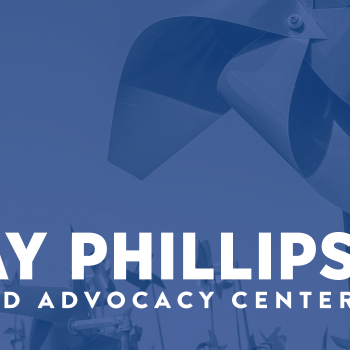
Dorchester Children’s Advocacy Center: Website Design, Website Development, Website Hosting

What we did for them: Website Design & Development, Website Hosting, Ongoing Website Maintenance

Industry: Nonprofit

Dorchester Children’s Advocacy Center is a 501c3 non-profit organization serving abused and neglected children and their families from Dorchester County and parts of Berkeley and Charleston Counties. Dorchester Children’s Advocacy Center works in collaboration with law enforcement, DSS, Guardian Ad Litems, Mental Health and other agencies involved in caring for abused and neglected children in our community. 

While designing the website, we focused on bringing a friendly, playful element without detracting from the serious nature of what Dorchester Children’s Advocacy Center is dedicated to. We accomplished a balance by creating hand-drawn elements, like icons and titles, while maintaining a clean and professional aesthetic.

Dorchester Children’s Advocacy Center’s main two focuses for the website were reporting abuse and donating. Consequently, we made sure there was a call-to-action (CTA) for both options in the header of the site, so no matter what page a visitor is on, they will always be able to see the option to donate or report abuse. 

Ease of use and a clean, clear design are always one of the primary focuses when we design websites for our clients. We designed their new website to be user-friendly from both the front end (for website visitors) and the back end (for when staff at Dorchester Children’s Advocacy Center needs to make a quick edit).   

Every single page received individual attention because each page has unique content. Dorchester Children’s Advocacy Center is a large organization and they provide several different services to the community. They have over 40 pages—they have a lot of services, offer all kinds of education & training, and there are a lot of different sections to highlight for donations and support. They organize many events. They have a lot of information about who they are and what they do. 

Their website was huge and we made it very easy for people to find what they were looking for. So, we condensed the top-level navigation and made each parent page which features a nice preview of all the sections under the page. Every page was addressed individually and designed based on what the page needed. 

A great example is the contact form. With their contact form, we made sure to consider what features would be easiest for both the user and the client. DCAC has 10 different departments information from a contact form would go to. We set up conditional logic which ensures forms will go straight to the person in the relevant department, making it a simpler experience for everyone involved.  

A more user-centric feature of the site is the section on the home page directed towards “Caregivers,” “Professionals,” or “Supporters.” It’s a different way to find a page you may need. So specifically, the Caregivers section goes to the therapy page, the Professionals section directs to educational resources, and the Supporters section routes to the donate option. Designing it this way is more engaging and considers the user’s perspective.   

It was interesting and fun to work on building out so many different pages with different content in a way unique to every page but still cohesive and consistent with the website as a whole. 

The Dorchester Children’s Advocacy Center is a very large organization with many decision-makers. Our graphic designer, Sarah, worked directly with 2 staff members, Faith and Melissa, to make sure all information and ideas were passed on properly and applied correctly on the website. We were ultimately able to present it to the board and had complete approval upon the first review. 

Visit the Website

Dorchester Habitat for Humanity: Website Design, Website Development, Website Hosting

What we did for them: Website Design & Development, Website Hosting, Ongoing Website Maintenance

Industry: Nonprofit

Habitat for Humanity works to provide people with decent, affordable housing. The nonprofit is also dedicated to building strength, stability, and self-reliance in the community. We had been providing IT services with the Dorchester branch of Habitat for Humanity for a while, and when they found they were in need of marketing help, we stepped forward to help them with a website. 

Their current website is a redesign of a website we made for them a few years ago. The original website we developed was still strong and functional, but every few years is a good guideline for getting a new website even if your current site is fine. A lot changes in three years—code programming changes, new plugins and extensions are available to be added, and it’s also a good time to sit down and revisit your business brand itself and think about how you want to present it. 

Additionally, at the time of our redesign, Habitat for Humanity corporate had new brand standards we needed to incorporate in updates on the website. The new brand standards included new logo and brand colors, typefaces, and other design guidelines we had to follow. 

Other than updating to reflect the brand, we wanted to make their website easier to use. Our goal was to make it so visitors coming to the website were easily able to find what they were looking for, whether it’s the Restore, how to donate, scheduling donation pickups, how to volunteer, or how the housing program works. We made it as easy as possible for people to help Habitat for Humanity. 

To achieve the goal of making the website as user-friendly as possible, we included a few new features. 

We wanted a specific ‘call to action’ (CTA) for how people can get involved, and we wanted to have a unique way to display this information rather than just a standard image slider. So, we designed a way to show a lengthy description with a call to action button to learn more about one of the three main ways they could help. The CTA feature is animated to automatically scroll and expose new sections so it’s not too much text all at once, and you can click on each tab individually.

We took great care to make sure each page is very clear while still being engaging. The content answers “what is this page and what should I be doing” while visuals and text are appealing and fit brand standards. The information on the site is arranged in a way that is easily readable and navigable but isn’t just placed in standard, boring, block ways. 

So, for example, you’ll find elements breaking out of their grids and boundaries to catch your eye, but the design remains balanced, structured, and flowing. We designed the website to be bright, friendly, and exciting. The layout is modern but clean, fun, and fresh. It’s intended to get people involved and excited about getting involved. 

One of ADVYON’s goals is to give back a portion of our time and financial rewards to local businesses who do great things in our community. We do a lot of work with nonprofits, and we put a good deal of effort into making it as easy as possible for people to help them. 

Visit the Website

Reagin Orthodontics: Web Design, Web Development, Website Hosting, Google Ads, Ongoing Marketing

What we did for them: Website Design & Website Development, Website Hosting

Industry: Medical

Reagin Orthodontics is an orthodontist’s office with a personality in Summerville, SC. They were a ton of fun to work with; they have a very unique personality and Dr. Reagin himself is really fun and aims to be super warm, inviting, and friendly. 

Even their office has personality—it’s decorated in all kinds of patterns and colors, and their main Summerville location even has a chalkboard wall as a central feature that gets decorated by a local artist. Whenever someone gets their braces off, they get balloons and take a picture with Dr. Reagin in front of a specially decorated wall.

These factors speak volumes about who they are and what kind of environment they offer. We wanted to take the friendly, fun vibe from the office and staff and translate that into their website. They had worked with other people in the past who had only produced cookie-cutter type websites for them, ones that did not reflect their personality at all. 

There were a lot of things for us to work with and it was very easy to pull from that to design and build a website that is not only user-friendly but user engaging—it really pulls you in. We made the functionality work very well with the decorative aspects of the website. 

Some of the custom features we included in their website design were new patient forms, a customized question button, and a feature that redirects people to the FAQ page every time they submit any kind of form. 

The new patient forms are not just forms that patients can print and bring with them; they can fill them out and submit them online. The customized question button lets whoever is checking on Reagin’s side know what page someone was on when they submitted the question, making it easier to answer the question, especially if the question was not specific (i.e. “how much does this cost?” instead of “how much does Invisalign cost?”). 

The slider section is super unique. It has curves and angles that play on each other and features cutouts of their ideal customers. The next section is a video of Dr. Reagin showing the office and showing some happy patients. It’s got an autoplay feature to where if you click to hear audio it starts the video over. The next section shows how the process works. We created an animation in that section that highlights the first step, then second, then third. It’s a cool user engagement feature, something that really draws your eye. 

The next section is an introduction to what pricing is like. It features different examples of patients that would need different kinds of treatments. It also gives a general estimate of what those kinds of corrections would cost, for those who are trying to get an idea of what their own treatment would involve or cost.  

View the Website

Chan’s Bookkeeping and Tax: Branding, Website Design, Website Development, Website Hosting

What we did for them: Small Business Branding, Small Business Website Design & Website Development, Website Hosting

Industry: Service Based Business 

Chan’s Bookkeeping & Tax offers bookkeeping, payroll, and tax preparation services in Summerville, SC. We redesigned their website and designed a new logo for them. When helping Chan’s with their branding, we made sure to keep a balance between making the brand very clean and straightforward while still keeping it distinctive and interesting. 

It was important to keep the design clean and straightforward because we wanted it to be a soothing, inviting, user-friendly website. We focused on the design imparting calming feelings and not being busy or overwhelming because taxes and payroll tend to be topics that stress people out. At the same time, we wanted to make sure to keep the design colorful, inviting, and recognizable to distinguish Chan’s Bookkeeping & Tax and engage website visitors.  

Another aspect unique to designing Chan’s Bookkeeping & Tax’s website and brand was keeping the client in mind while also keeping their clients in mind. We wanted to be sure to appeal to the client’s tastes as well as their client’s taste, so we needed to make sure to strike a balance between a more delicate, feminine appeal, and a stronger, bolder, more professional look. 

The biggest focus in designing this brand and website was taking a strict, straightforward subject like taxes and bookkeeping and making it compelling and visually appealing. We wanted to make it exciting, more than just text on a page, so we utilized different design elements so the eye will be naturally drawn to moving down the page.

View the Website